DataCamp Mobile Home: From Content Overload to 7% Course Lift
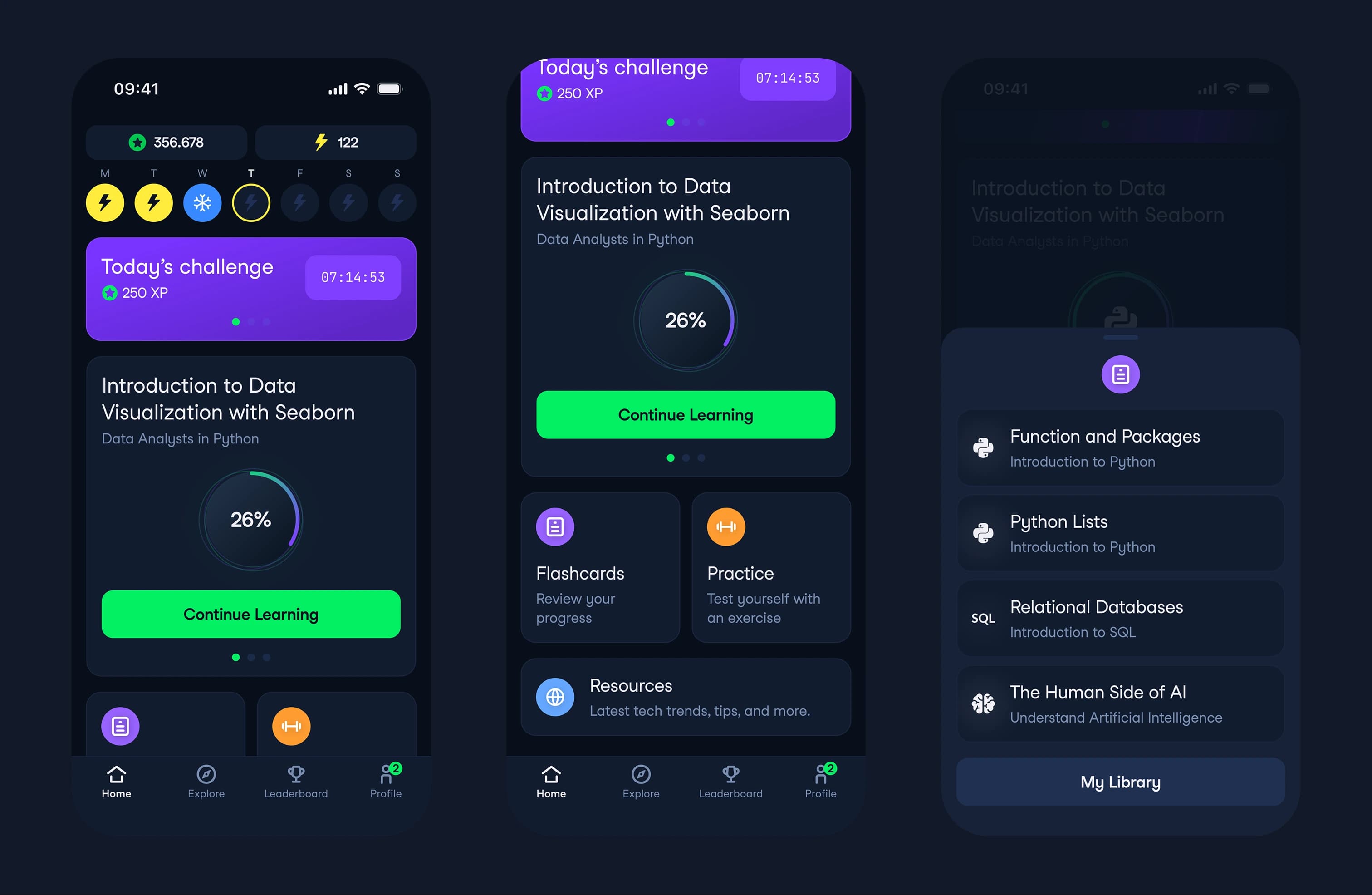
I bet that users think in actions, not courses. Restructured the entire home screen around learn/practice/review instead of course types. Bounce rate dropped 10%, course engagement rose 7%.

Why This
9.3% of users opened the home screen and did nothing.
Not because they were lost. Because the screen organized content by courses, and users think in actions.
I restructured the entire screen around three verbs: learn, practice, review. That mental model shift drove every design decision and lifted course engagement by 7%.
Root Cause
The home screen organized content by course type. Python courses here. SQL courses there.
But users do not open an app thinking "I want to navigate my course catalog." They think: I have 10 minutes, what can I do right now?
Each course card presented multiple actions without clear hierarchy. Users faced decision fatigue at the card level, unsure which action matched their intent.
9.3% bounced without doing anything. For a subscription app, every bounced session is a missed opportunity for learning momentum — the behavior that drives long-term retention.
How I Built
I restructured the screen around three actions: learn, practice, review. Continue learning carousel at the top. Two entry points for practice and reviews via bottom modals. Header thinner, XP and streaks front and center.
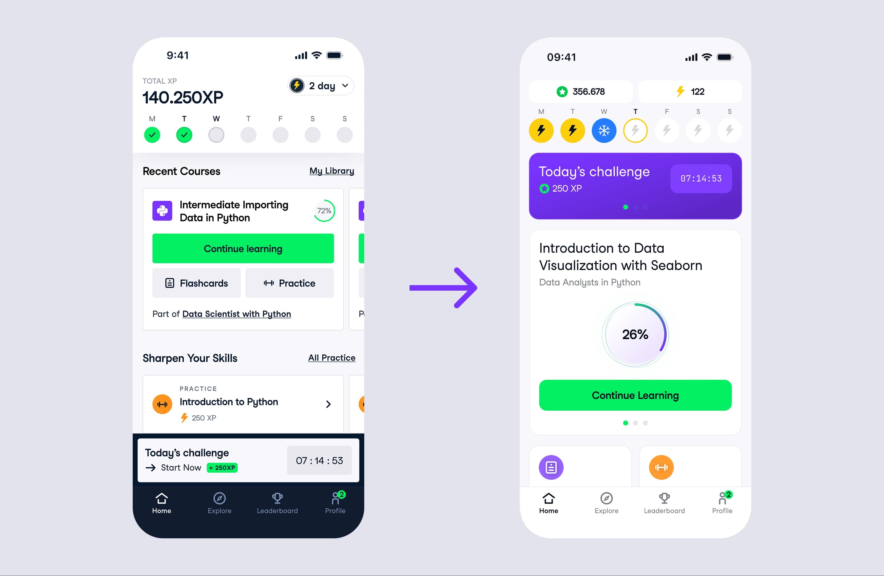
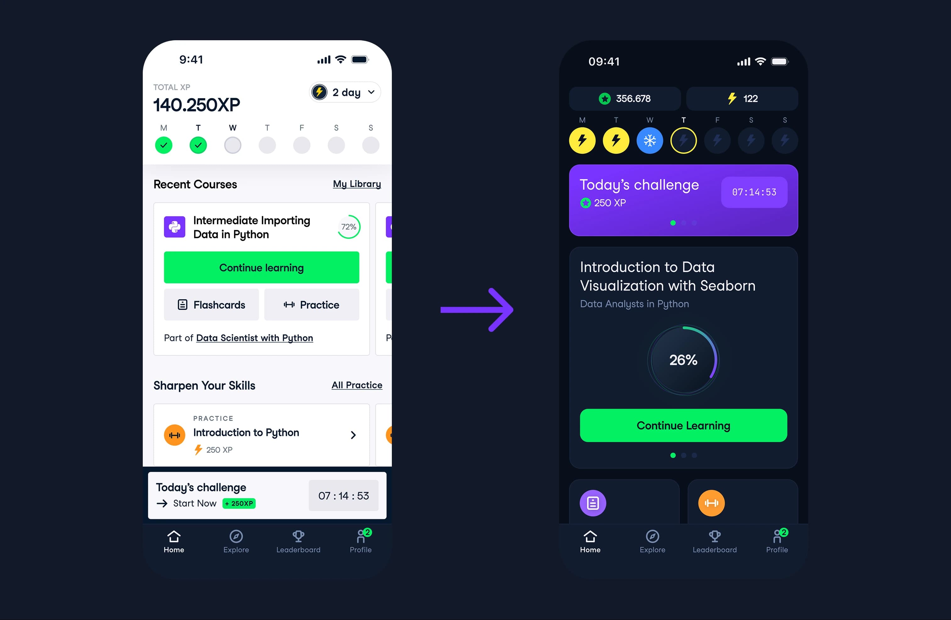
“Every user job mapped to an action, not a course. That was the argument that won.”
What Shipped
Bounce rate down 10%. Time on screen from 9 to 8 seconds. Course XP up 7%.
Then the overall XP metric dipped 2.4%. I dug in — it was not the design. Practice modals were empty for unsupported courses. That got rolled back. The design direction held.
The action-based structure is now the foundation for all home screen iterations.
What I'd Do Differently
I would add a practice content coverage check before shipping. The design assumed practice would work for every course. It did not. A simple availability check in the modal logic would have prevented the XP dip and the stakeholder concern. The fix was easy once we found it, but I should have anticipated the edge case.
More Case Studies
Explore other projects I've worked on
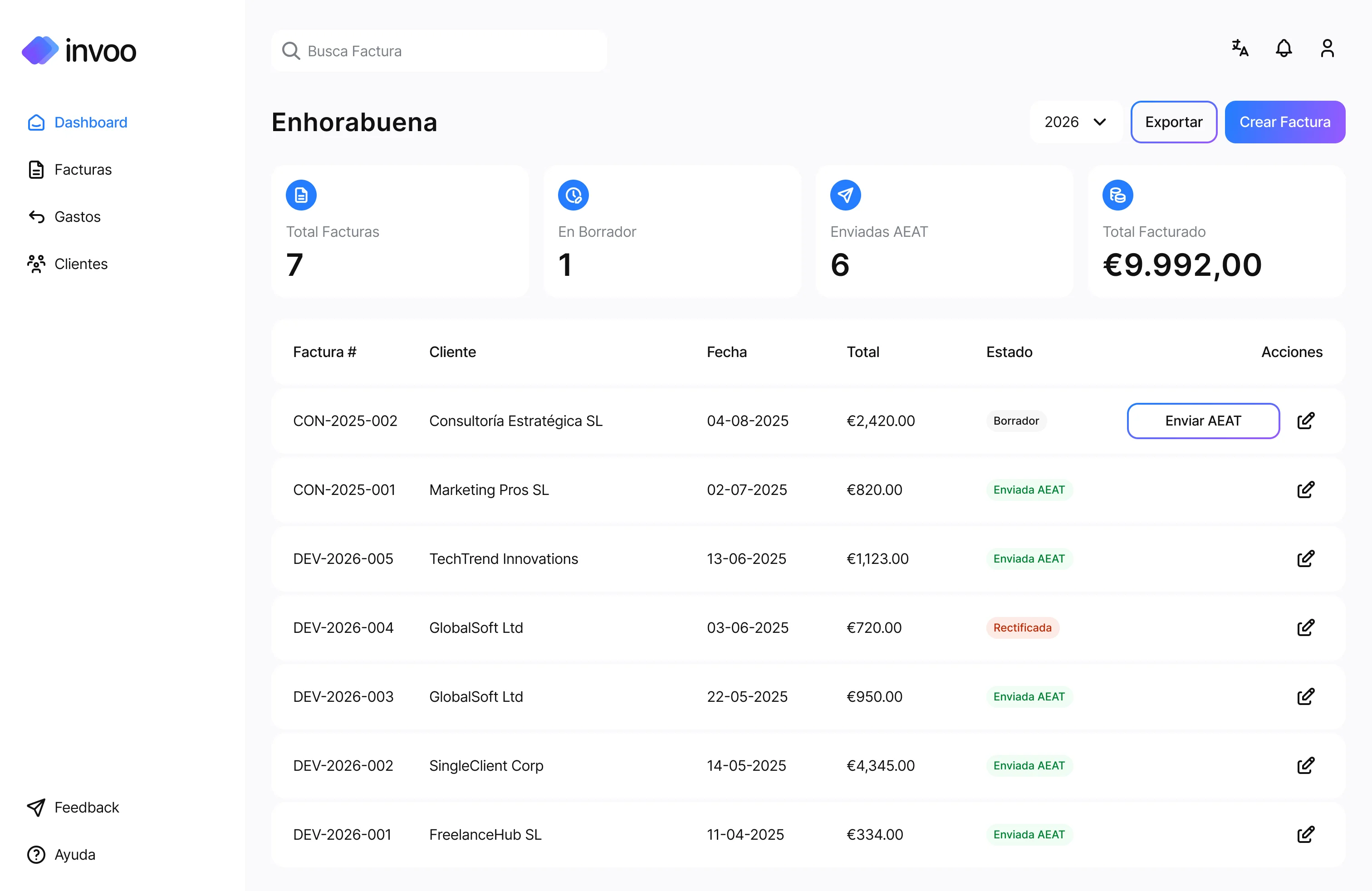
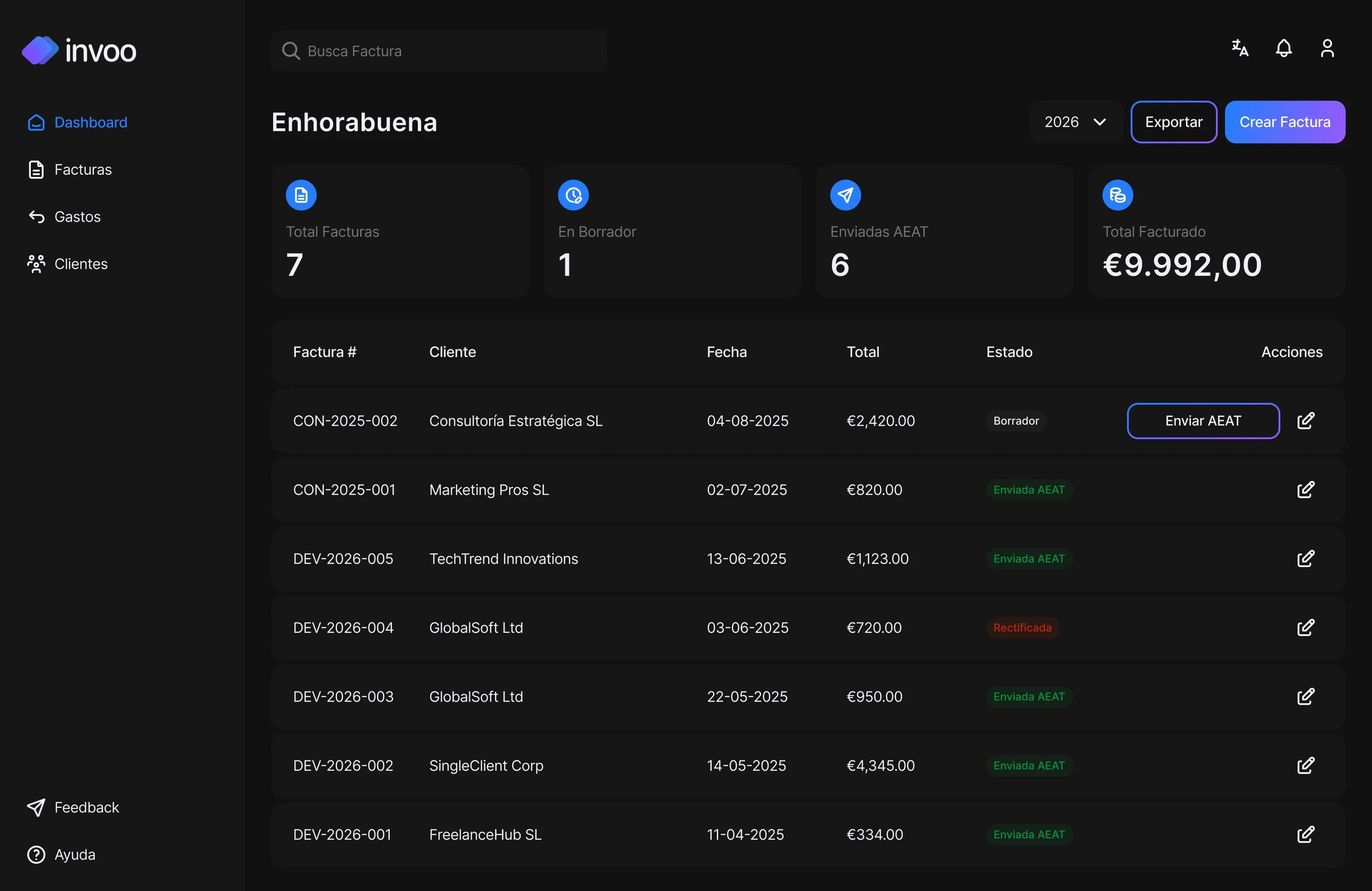
invoo: From Idea to Multi-Platform Product
Co-founded an invoicing tool for Spanish freelancers. Built web and mobile from scratch in 2 months. 150+ waitlist signups, zero ad spend. Launched May 2026, live with the first cohort.
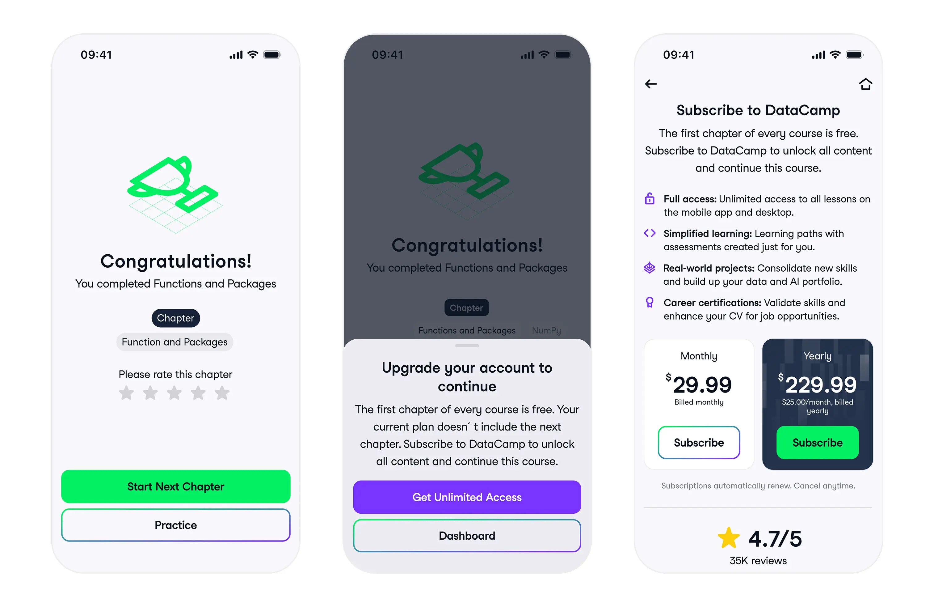
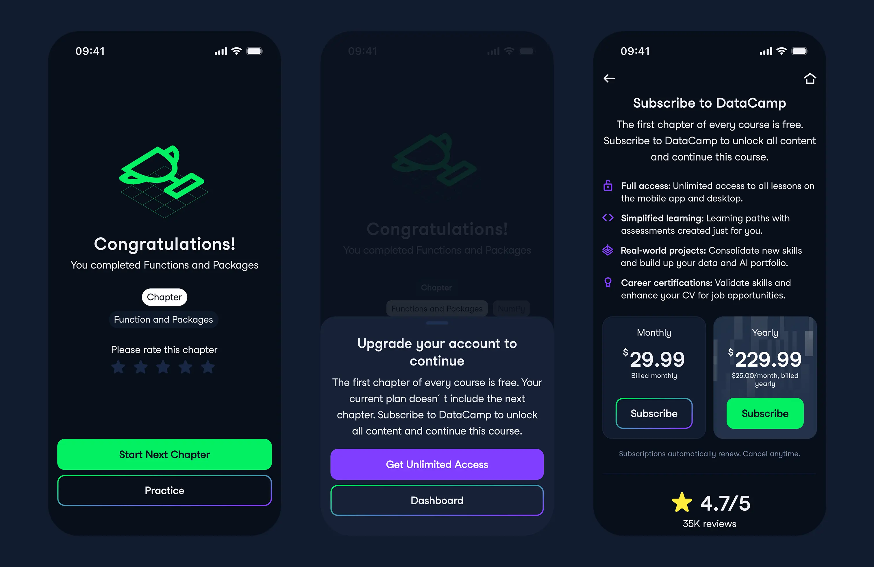
DataCamp Paywall: 50% Conversion Lift From Deleting a Feature
65% of users bounced on a screen before ever seeing the paywall. I deleted it entirely and lifted conversions by 50%.
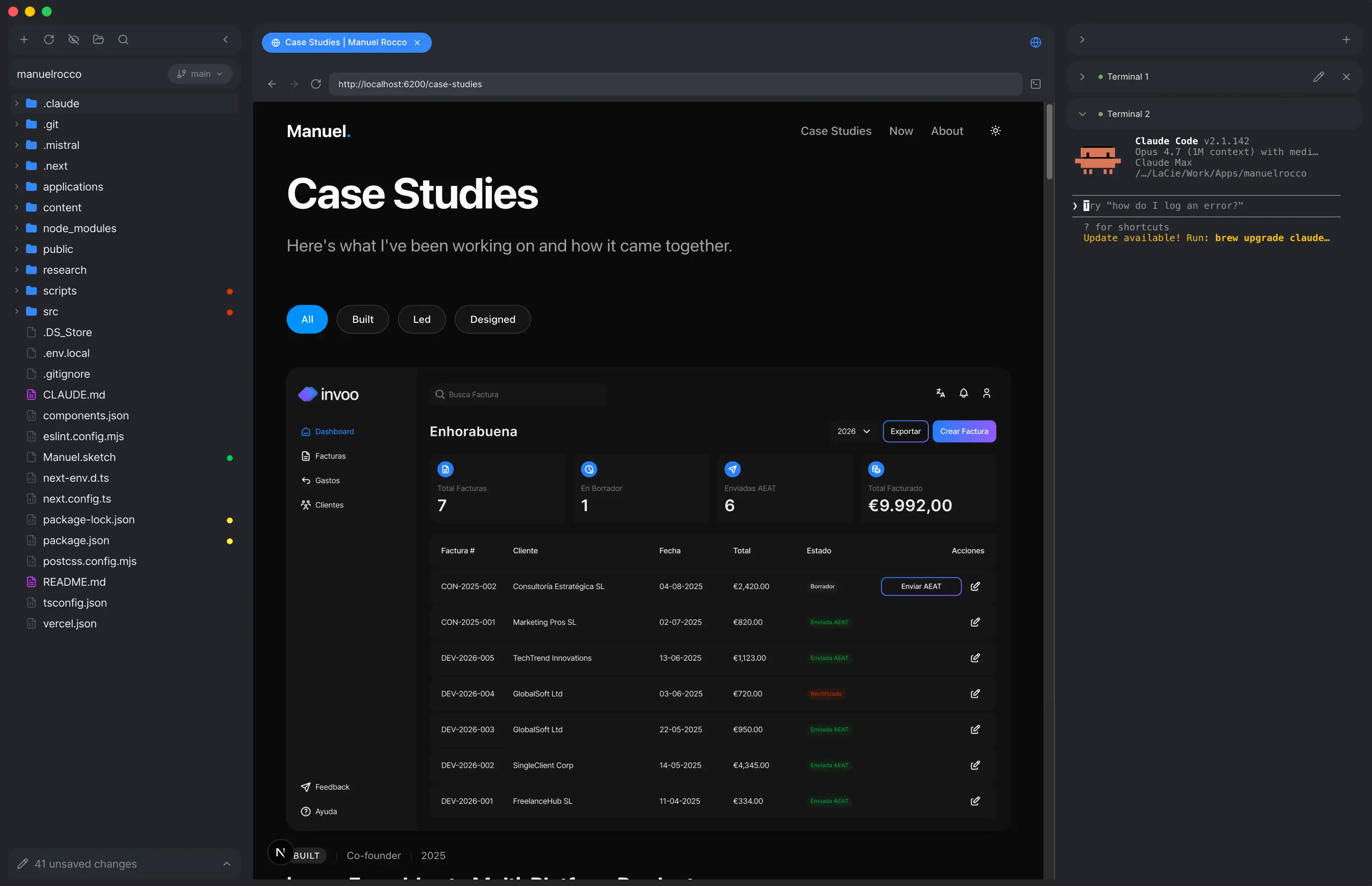
Deck: The IDE I built because nothing on the market fit
Existing IDEs are either cluttered with dev features I don't use or too heavy on agentic workflow. I wanted something simple: read code files, render Markdown nicely, and run Claude Code in multiple terminals side by side. So I built it. Electron, React, TypeScript, CodeMirror, xterm.js. Actively maintained.
ai-org: scaffolding I clone into every new project
A reusable Claude Code plugin that ships four portable layers into any repo: agents with a point of view, skills with explicit rules, commands that trigger workflows, and product knowledge the AI can actually read. Running in four of my active projects, plus designers at DataCamp using it to ship code they wouldn't have attempted alone.